LJ Sedgwick

Content Writer for Coaches and Course Creators

  • About
  • Work With Me
  • Portfolio
  • Contact
  • Blog

January 17, 2019 by LJ Sedgwick 2 Comments

Create Easy Colour Schemes From Photos Using Indesign

Getting your colour scheme right can make or break your project. Whether you’re picking your new brand colours or creating new business cards, you want a way to create easy colour schemes.

You might turn to websites like ColourLovers or Paletton for inspiration. Why not? They’re both very good options. I used Paletton to come up with my own brand colour scheme.

Consistent colours are a great way to build a visual brand. Learn how to create easy colour schemes from photos using InDesign in this tutorial.
Pin this!

But there’s a tool in InDesign that can also help you find a more custom solution. By sampling colours from a photo, you won’t be using the same colour schemes as everyone else. And InDesign automatically chooses the shades that work well together.

So let’s fire up InDesign and get started.

How to Use InDesign to Create Easy Colour Schemes

You’ll need an image to start with. You could always choose a photo of your company HQ or something that sums up your brand.

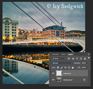
I’m using this image I took in December 2018 of light trails along Newcastle’s Quayside.

The source image for creating easy colour schemes.
The image I’m using – from my Flickr account!

Create a new document in InDesign. Head to File > Place and drop the image into the document.

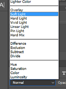
Browse to the toolbox and choose the Colour Theme Tool. It looks like the eyedropper. In fact, click and hold on this tool and you’ll be able to access the regular Eyedropper Tool.

The Colour Theme Tool, used for creating easy colour schemes.
The Colour Theme Tool

With this tool, simply click on the photo to sample the colours. InDesign will do the rest.

The options available for creating easy colour schemes.
Choose from five different colour palettes

InDesign automatically selects colours from your image to create suggested palettes. Click on the arrow to see four more alternative palettes, depending on the look you’re ultimately going for.

Adding swatches is also simple for creating easy colour schemes.
Add to Swatches

Click on the Add to Swatches icon to the right of the suggested colour palettes to ‘save’ the chosen palette.

The new swatches, perfect for creating easy colour schemes.
Your new swatches

InDesign adds the new swatches within a folder so you can easily find them. It also gives the CMYK or RGB values of each colour, depending on your document’s colour mode.

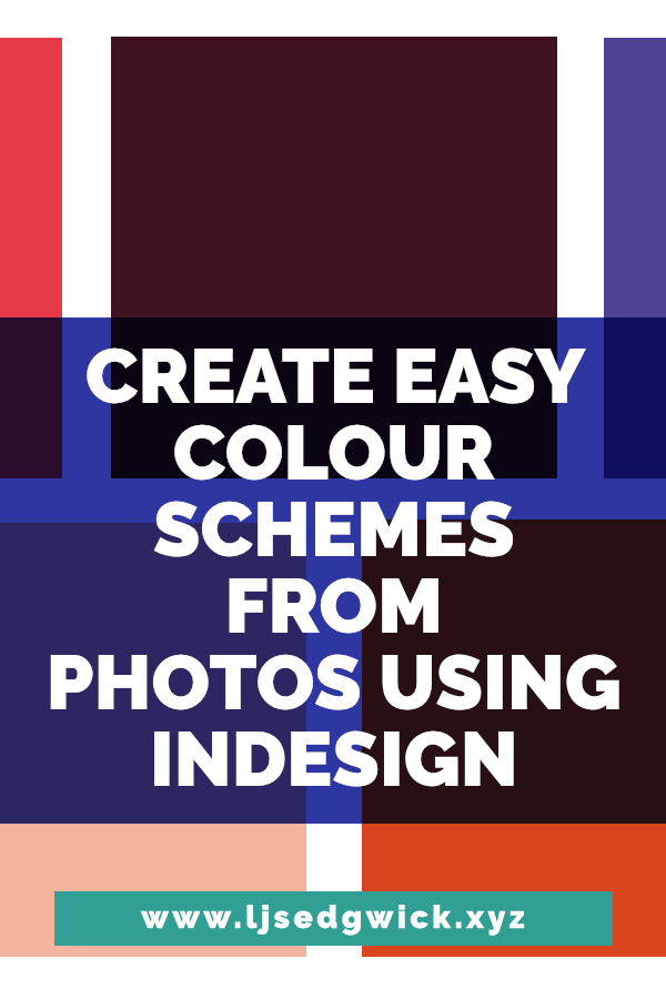
This is what my chosen theme would look like as colour blocks.

The results of the tutorial!
My colours!

Now you can go ahead and use your colours in a document. Remember, InDesign only saves palettes into the working document. You’ll have to save the swatches and load them into other documents if you need to work across documents with the same colours.

Here’s one I made earlier!

And here’s a quick example of a document created using just those colours.

The results of the tutorial!
Example

You could also export the swatches for use in Illustrator and Photoshop.

So there you have it! A simple way to make easy colour schemes using photographs in InDesign. The world is your colourful oyster!

And if you liked this tutorial, you might also enjoy this swift walkthrough for boosting colours in Affinity Pro.

Want to learn how to write good blog posts quickly?

Sign up below and I’ll send you my cheeky checklist and guide. I’ll also send you other blogging resources from time to time.

* indicates required

Please select all the ways you would like to hear from LJ Sedgwick:

You can unsubscribe at any time by clicking the link in the footer of our emails. For information about our privacy practices, please visit our website.

We use Mailchimp as our marketing platform. By clicking below to subscribe, you acknowledge that your information will be transferred to Mailchimp for processing. Learn more about Mailchimp’s privacy practices here.

Filed Under: Software Tutorials Tagged With: indesign, software, tutorial

January 11, 2018 by LJ Sedgwick 2 Comments

How to Boost Colours in Affinity Photo

Digital cameras have come on in leaps and bounds over recent years. But sometimes you still just want to boost colours to give images that POP of life.

There are various ways to do it in Serif’s Affinity Photo. Adjustment layers make it particularly easy.

There are many ways to boost colours in Affinity Photo. But in this tutorial, you'll be using Lab Colour to boost colours and make your images POP!

But I want to get you out of your comfort zone! I’m going to show you how to boost colours in Affinity Photo using the Lab colour mode. You’ll use layers, colour formats, and layer masks to really make your images sing.

So let’s crack on!

Preparing the Image

For this tutorial, I’m using this image. It’s my own photo from my 2017 trip to Venice, looking up at the Bridge of Sighs. Or you can use your own and apply the same principles!

There are many ways to boost colours in Affinity Photo. But in this tutorial, you'll be using Lab Colour to boost colours and make your images POP!
The starting image

So open up your image in Affinity Photo. Go to Document in the top menu bar, scroll down to Colour Format, and across to Lab.

There are many ways to boost colours in Affinity Photo. But in this tutorial, you'll be using Lab Colour to boost colours and make your images POP!
The Colour Format menu

Now you’ve entered a new colour mode. Neither RGB nor CMYK can perfectly replicate the colour spectrum that humans can see. Lab colour was introduced as a way to simulate this.

But you can’t really render it on a screen or print it so it has limited value. Still, for our purposes, it offers a cool way to boost colours.

Moving On To Boost Colours

Now we’re going to actually boost colours. Click on the Adjustment Layer icon (the circle divided into black and white) at the bottom of the layer panel. Choose Curves from the menu.

There are many ways to boost colours in Affinity Photo. But in this tutorial, you'll be using Lab Colour to boost colours and make your images POP!
Your Layers Panel should look like this.

Under the graph, it will say ‘Master’ on the central dropdown menu. That’s because images in Lab color mode are split into three channels. L, a and b. Hence the name. We want to make changes to a and b. So change the channel to ‘AOpponent’ in the dropdown.

There are many ways to boost colours in Affinity Photo. But in this tutorial, you'll be using Lab Colour to boost colours and make your images POP!
Your first curve should look like this

Now you want to click on that central diagonal line and drag it to match the screenshot above. Those boxes dividing the panel into quarters are really useful.

The first anchor you add should be along the bottom axis and one quarter box in from the left. The second is along the top axis, and one quarter box in from the right.

In the Channel dropdown, select channel ‘b’. Repeat this process.

There are many ways to boost colours in Affinity Photo. But in this tutorial, you'll be using Lab Colour to boost colours and make your images POP!
Your second curve should look like this

When you’ve finished altering the curves, the image should look something like this.

There are many ways to boost colours in Affinity Photo. But in this tutorial, you'll be using Lab Colour to boost colours and make your images POP!
Much brighter colours!

You can just leave it there if you want. Be warned; if you use this technique on people, their skin tone will end up really unflattering. So we’re going to use a layer mask to reveal part of the original image below. On a portrait, you’d use the layer mask on the skin.

Layer Masks in Affinity Photo

Because Affinity Photo lets you work on adjustment layers, you can apply your layer mask direct to the adjustment layer. So with the adjustment layer selected in the layer panel, simply click on the layer mask icon. It’s the one that looks like a piece of cardboard with a hole in it.

Using a paintbrush set to black, paint over the parts of the adjustment layer that you want to hide. They’ll reveal the colour of the layer below. In this example, I’ve removed some of the excess colour on the brickwork to the left of the image.

There are many ways to boost colours in Affinity Photo. But in this tutorial, you'll be using Lab Colour to boost colours and make your images POP!
Step 8

When using Layer masks, painting with black hides the layer to reveal what’s below. Painting with white will bring the layer you’re painting on back into view. If you were doing this on a face, you’d bring back the natural skin tone.

To get a soft appearance, use a soft-edged brush. Use the hardness slider in the top menu bar to remove the harsh edges of the brush.

There are many ways to boost colours in Affinity Photo. But in this tutorial, you'll be using Lab Colour to boost colours and make your images POP!
Step 12

You can add other adjustment layers if you feel they’re necessary. Or you can flatten the image and return to RGB using the Colour Format menu. You’ll need to do that if you want to use the file online since computer screens display in RGB.

And here’s your final piece!

There are many ways to boost colours in Affinity Photo. But in this tutorial, you'll be using Lab Colour to boost colours and make your images POP!
The final piece!

Give it a go! And share your results in the comments below.

Filed Under: Software Tutorials Tagged With: Affinity Photo, design, graphics, software, tutorials

December 28, 2017 by LJ Sedgwick 2 Comments

I love Adobe…but I’m happy to recommend Affinity

Adobe pretty much changed the graphic design landscape when they released Photoshop 1.0 way back in 1990. You no longer needed a design degree, a studio and a steady hand to produce beautiful work. Fast forward to 2017, where their suite of powerful tools still provide industry-standard software to home users and professionals alike. Yet if Adobe is so accessible, why do I recommend Affinity products instead?

Adobe Creative Cloud is still hard to beat for industry-standard creative software, so why do I now recommend Affinity Photo and Designer to fellow creatives? Click here to find out.

I first came across the Affinity products in the mid-1990s. Only they weren’t called Affinity then. Instead, you had Serif PagePlus, DrawPlus and PhotoPlus (versions of InDesign, Illustrator and Photoshop respectively). I was only in my very early teens but I was fascinated by graphic design software even then.

Adobe Creative Cloud is still hard to beat for industry-standard creative software, so why do I now recommend Affinity Photo and Designer to fellow creatives? Click here to find out.
I made this mockup of a laptop displaying Affinity Designer using a stock photograph and Affinity Photo.

Teaching myself to use Serif PagePlus made it a whole lot easier to land my first office job in 2006. It only took a matter of weeks to get up to speed on Adobe InDesign. While I first picked up Photoshop 7.0 in 2003, I still had a soft spot for the Serif products.

Serif Has A Real Affinity With Software

Last November, I bought my first hybrid laptop. It’s basically a tablet with a detachable keyboard. While it’s awesome, there’s no way it’ll run Photoshop. So I went looking for Serif PhotoPlus, hoping it would provide a less-demanding alternative so I didn’t need my graphics laptop every time I wanted to edit a photo.

Serif had retired PhotoPlus and replaced it with Affinity. I downloaded the trial and knew they were onto something special. While it didn’t do everything Photoshop could do, it could do the things I’d want to do while ‘on the go’. It could even open my Photoshop .psd files!

Let me show you. I got a new Canon 750D for Christmas so I popped out into the garden to take some test shots. The image below is pointing down into a gooseberry bush.

Adobe Creative Cloud is still hard to beat for industry-standard creative software, so why do I now recommend Affinity Photo and Designer to fellow creatives? Click here to find out.
My ‘before’ image.

And now, in true Blue Peter-style, is one I made earlier.

Adobe Creative Cloud is still hard to beat for industry-standard creative software, so why do I now recommend Affinity Photo and Designer to fellow creatives? Click here to find out.
The ‘after’ image!

There isn’t a whole heap of image editing going on here (stay tuned for the quick tutorial below). But Affinity PhotoPlus was more than up to the challenge of editing my photo.

Take advantage of its HDR functionality. Work across an infinite number of layers. Batch process your files for greater productivity. Hell, it even comes with a RAW image processor. That certainly makes it easy to recommend Affinity.

Affinity Photo – The Verdict

I have three main reasons to recommend Affinity Photo.

  1. This is a pretty powerful program, all for a single, affordable price.
  2. You get access to continual software updates – no expensive subscription here.
  3. It’s focused on photo editing. You won’t get bogged down with additional tools, such as 3D stuff, like you do in Photoshop.

On the downside, it does have a bit of a learning curve, much like Adobe Photoshop. If you’re experienced with Photoshop, it can take time to learn what the Affinity Photo alternatives are. For example, I wouldn’t think to look in the Filter menu for their equivalent to Adobe’s Distort transformation.

Some of the tutorial videos online only make sense if you have prior experience with image editing software. That said, the release of their Affinity Photo Workbook (aff link) should alleviate problems learning its true capability.

I teach Photoshop within my day job (and I post tutorials on this blog). But I do recommend Affinity Photo to students who just cannot afford Adobe Photoshop.

Affinity Designer – The Verdict

I’ve had a love/hate relationship with Illustrator since CS2. I’m not a natural illustrator so I have less reason to use it.

That said, Affinity Photo impressed me so much that I decided to try out Affinity Designer – their equivalent of Adobe Illustrator. Again, I’m coming to this software with existing experience, but still, this is the first thing I made upon firing up Designer.

Adobe Creative Cloud is still hard to beat for industry-standard creative software, so why do I now recommend Affinity Photo and Designer to fellow creatives? Click here to find out.

I followed this tutorial, changing the colours to suit my branding.

Based on my run-through to create the lighthouse, I can say that Designer is a program of two halves.

On one hand, it’s actually easier to use than Illustrator. Many of its features are so similar that I didn’t need to look them up, but worked in a more intuitive way than the Adobe originals. It doesn’t feel as ‘heavy’ to run, so I didn’t have the continual crashes that make Illustrator such a pain.

On the other hand, it’s deeply infuriating. There’s no obvious way to reset the workspace if you start moving panels around. Functions like the Gradient Tool aren’t immediately clear. There’s no immediately obvious way to save colour swatches.

These are essentially minor niggles. If you’re coming to illustration software ‘cold’, then I’d recommend Affinity Designer as a better place to start than Illustrator. The companion Affinity Designer Workbook (aff link) is also fantastic, leading you through the design process as well as how to use the software.

The two programs also work well together. It’s easy for me to work across them, speeding up my workflow and minimising frustration. Win!

But I promised you a swift tutorial, didn’t I?

Simple Photo Tutorial – Boost Contrast and Crop

Open your image in Affinity Photo.

Adobe Creative Cloud is still hard to beat for industry-standard creative software, so why do I now recommend Affinity Photo and Designer to fellow creatives? Click here to find out.

Duplicate your layer by hitting Ctrl and J (same shortcut as Photoshop).

Adobe Creative Cloud is still hard to beat for industry-standard creative software, so why do I now recommend Affinity Photo and Designer to fellow creatives? Click here to find out.

Click on the blending modes drop-down menu in the Layer panel and choose ‘Soft Light’.

Adobe Creative Cloud is still hard to beat for industry-standard creative software, so why do I now recommend Affinity Photo and Designer to fellow creatives? Click here to find out.

Blending an image with itself is a simple way to boost contrast and increase saturation. Now, that central thorn isn’t exactly in the middle so we’re going to crop the image to improve the composition.

Choose the crop icon from the toolbox (fourth one down from the lefthand icons). In the top menu bar, click on ‘Unconstrained’ to access the ratio drop-down menu. Choose ‘Original Ratio’.

Adobe Creative Cloud is still hard to beat for industry-standard creative software, so why do I now recommend Affinity Photo and Designer to fellow creatives? Click here to find out.

Click on the top lefthand corner handle and drag it diagonally down and to the right. Because we’ve constrained the ratio to match the original proportions, it can’t end up too narrow or too tall.

Adobe Creative Cloud is still hard to beat for industry-standard creative software, so why do I now recommend Affinity Photo and Designer to fellow creatives? Click here to find out.

Once the thorn is in the middle, it’s good to go. Click Apply in the top menu bar. Now we’re going to resave it for use online. Go to Document in the top menu bar and choose Flatten. This will compress the layers.

Now go to the File menu and down to Export.

Adobe Creative Cloud is still hard to beat for industry-standard creative software, so why do I now recommend Affinity Photo and Designer to fellow creatives? Click here to find out.

Choose the JPEG option and input your chosen size. For use on a blog, a quality setting of 80-90 is sufficient. Hit ‘Export’ and you’re done!

That’s Why I Love Adobe but Recommend Affinity Products

They’re both powerful programs but for a super affordable price. No lengthy subscriptions and you can extend their functions by installing additional brushes or other resources.

If you’re not sure, download a trial version of Affinity Photo or Affinity Designer. Download them, put them through their paces, and see if you don’t love them too.

If you want to buy your own copies, Serif is running a 20% discount on all of their Affinity apps until 5 January 2018.

What are you waiting for?

Filed Under: Software Tutorials Tagged With: Affinity Designer, Affinity Photo, graphic design, photoshop, Serif, software

August 24, 2017 by LJ Sedgwick 1 Comment

How to apply a digital watermark to your images in Photoshop

You’ve probably seen images online with watermarks on them. Some of them are very blatant, some are far more unobtrusive. In this tutorial, I’m going to show you how to add a subtle digital watermark in Photoshop.

Ever seen images with a subtle digital watermark online and wondered how they were made? This guide shows you how to make your own in Photoshop!

I’m using my own image from the website for my fiction pen name – you can easily use your own!

Ever seen images with a subtle digital watermark online and wondered how they were made? This guide shows you how to make your own in Photoshop!
My digital watermark

All you need is Photoshop – and some images.

Ever seen images with a subtle digital watermark online and wondered how they were made? This guide shows you how to make your own in Photoshop!

Let’s get started on your digital watermark!

Go ahead and open Photoshop. Head to File and then New.

Ever seen images with a subtle digital watermark online and wondered how they were made? This guide shows you how to make your own in Photoshop!
Step 1

Now we’re going to make a new image. The size doesn’t really matter because we’re going to be making a brush from the result. But make it at least 1000px wide.

Ever seen images with a subtle digital watermark online and wondered how they were made? This guide shows you how to make your own in Photoshop!
Step 2

Now get the Type tool. I’m using the copyright symbol (©) and my photographer/fiction writing pen name.

So I pressed Alt and 0169 on my numeric keypad to make the copyright symbol. Then I just typed my name in my brand font. In my case, it’s UglyQua.

Ever seen images with a subtle digital watermark online and wondered how they were made? This guide shows you how to make your own in Photoshop!
Step 3

Now we’re going to turn this into a brush. That’s going to let you just stamp your text onto each image as required. It’ll save you typing it over and over! And this is the start of your digital watermark.

Now go to Edit in the top menu bar and choose ‘Define Brush Preset’.

Ever seen images with a subtle digital watermark online and wondered how they were made? This guide shows you how to make your own in Photoshop!
Step 5

You’ll get a little preview of what it’ll look like. Because it’s black on white, your brush will have a transparent back.

Give it a name if you want, and hit OK.

Now we’ll apply your watermark.

So now go ahead and open the image you want to add a digital watermark to.

Ever seen images with a subtle digital watermark online and wondered how they were made? This guide shows you how to make your own in Photoshop!
Step 6

I’m using an image I took of the Millennium Bridge in Newcastle upon Tyne.

Create a new layer and rename it ‘Watermark’. The new layer icon is the second from the right at the bottom of the Layers panel. You need that new layer so you can blend the digital watermark with the image below.

Ever seen images with a subtle digital watermark online and wondered how they were made? This guide shows you how to make your own in Photoshop!
Step 7

Now access the paintbrush icon in the toolbox on the left. Find your brush in the brush preset picker in the top menu bar. If your brush was the last thing you made, it’ll show up straight away.

Ever seen images with a subtle digital watermark online and wondered how they were made? This guide shows you how to make your own in Photoshop!
Step 8

Check the brush settings are at ‘Normal’ and 100% opacity. I’ve chosen white but this also works with black (depending on the background of your image).

Just use the brush like a stamp and click once on your image wherever you want the digital watermark to appear. Use the [ and ] keys to make the brush larger or smaller.

Use the Move Tool if you want to move it around once you’ve made the watermark.

Once you’re happy, find the bar saying ‘Normal’ in the Layers panel. Click on it and choose ‘Soft Light’ from the blending mode option.

Ever seen images with a subtle digital watermark online and wondered how they were made? This guide shows you how to make your own in Photoshop!
Step 9

This will blend your digital watermark with the image below. It makes it less obtrusive.

Ever seen images with a subtle digital watermark online and wondered how they were made? This guide shows you how to make your own in Photoshop!
Step 10

And here’s your final image! You can alter the opacity in the opacity bar to make it less transparent if you want a more subtle effect. Just drag the slider to the left, or type in a new value.

So there’s your digital watermark, ready to use!

Let me know if there’s something else you’d like to know in Photoshop. Or you can find out how to boost your colours in Photoshop too.

Filed Under: Software Tutorials Tagged With: brushes, digital watermark, photography, photoshop, tutorial

Find me online!

 facebook-48google-plus-48
instagram-48 twitter-48 pinterest-filled-50

Icons by Icon8.

Who am I?

I help tech startups connect with new audiences by writing in-depth blog content!

Find…

Coded Creative

Coded Creative

Recommended Wordpress Themes

Beautiful Dawn Designs - Feminine WordPress Themes

Links

About
Work With Me
Portfolio
Contact
Privacy Policy

Email me!

hello@ljsedgwick.xyz

Find Me Online

Who am I?

I help coaches and course creators connect with new audiences by writing in-depth blog posts and course content!

Copyright © 2025 · Hello Pro on Genesis Framework · WordPress · Log in